
Brand & design system · Data visualisation
Making high-performance analytics feel human
A GPU-powered analytics platform needed more than a new logo. We built the brand map, guidelines, and cloud design system that let a global UI team turn sophisticated engineering into interfaces business users could trust.
- GPU + CPUProduct architectureHybrid engine for interactive analytics
- Global UIDelivery modelDistributed designers and engineers
- Brand → UXEngagement arcSystem first, product UI next
The challenge
A logo is not a language for a complex product.
Polymatica’s competitive edge was technical. A hybrid GPU and CPU architecture made interactive analytics on very large datasets feel closer to exploring a map than waiting on a report. The company talked about empowering "citizen data scientists": numerate business people who need answers at the speed of a question, without locking insight inside static BI dashboards.
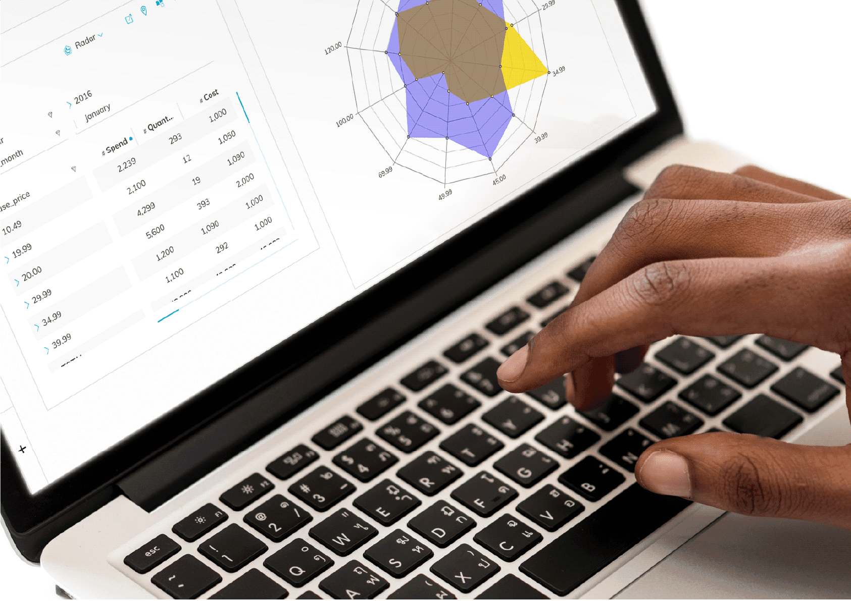
That kind of product changes the design problem. When filters, clusters, and charts can update almost instantly, the interface has to stay clear under continuous exploration. Intimidating chrome or inconsistent patterns undo the engineering advantage.
Commercially, the company had just "rebranded." In practice that meant a new logo. There was no shared brand map, no documented visual system, and no cloud component library for a distributed global UI team. Without that foundation, every screen risked inventing its own dialect of Polymatica.
Approach
Brand map first, then a system the product can ship from.
We treated the engagement as product design infrastructure, not a PDF brand tidy-up. Starting with brand mapping (vision, purpose, values, tonal range, and how the product should feel to a non-specialist), we built the full brand guidelines the Head of Design needed after the logo change: identity, colour (including chart and legend systems), typography, imagery, and UI principles.
Those rules were expressed as cloud-based Figma libraries so designers and engineers, wherever they sat, shared one Monday-morning source of truth. The guidelines were the narrative; the libraries were the operating system for the interface work that would follow.
- 01Colour. Six bold primaries with tints, shades and exact hex values, published as shared colour styles in the team's cloud Figma library.
- 02Iconography. A thin, elegant linear icon set laid out on the shared Figma canvas, drawn on a 32px grid that scales in multiples of 8.
- 03Typography. Titillium Web for headlines, with a permitted weight ladder from Thin to Bold. Semi Bold is the headline default.
Product context
When answers arrive in seconds, curiosity stays alive.
Traditional BI often forces a stop-start rhythm: filter, wait, redraw, wait again. Polymatica’s engineering bet was different. By putting heavy analytical work on GPUs (hired talent included engineers from the gaming industry who already thought in parallel workloads), the platform could keep exploration conversational.
That is why a robust design system mattered strategically. The engineering team had made analytics fast. Design’s job was to make that power feel intuitive rather than intimidating, so subject experts could investigate data without constantly routing every question through specialists.
- CPU for application logic, orchestration, and data management
- GPU for aggregations, clustering, pattern detection, and visual calculation
- UI patterns tuned for continuous filtering and comparison, not one-shot reports
What we delivered
A strategic product asset, not a style guide souvenir.
Deliverables covered the brand map, visual identity (logo systems, palette, type, graphic style, photography direction), specialist data-visualisation colour systems, UI design specifications, and the cloud Figma libraries that kept a global team aligned.
The guidelines gallery on this page is the visible evidence. The harder win was organisational: one coherent language the product could extend into deeper UX and UI work without reinventing basics on every sprint.

Outcome
A foundation for the UI work that came next.
By the end of a six-month engagement, Polymatica had a maintained source of truth for brand and product UI: cloud Figma libraries, documented principles, and a brand map that explained how the product should feel to citizen analysts as well as specialists.
That system was never the end of the story. It was the precursor to further UX and UI on a platform whose value depends on people staying in flow with their data. The design system made that next chapter possible without the interface fracturing as the product grew.