


The brief
Comparing film audience metrics for studio analysts
An analyst at 20th Century Fox wants to be able to analyse how the audience for X-Men Apocalypse (defined as the Target) compares with the aggregated audience (defined as the Benchmark) of the last three movies that featured X-Men: Deadpool, X-Men: Days of Future Past and The Wolverine.
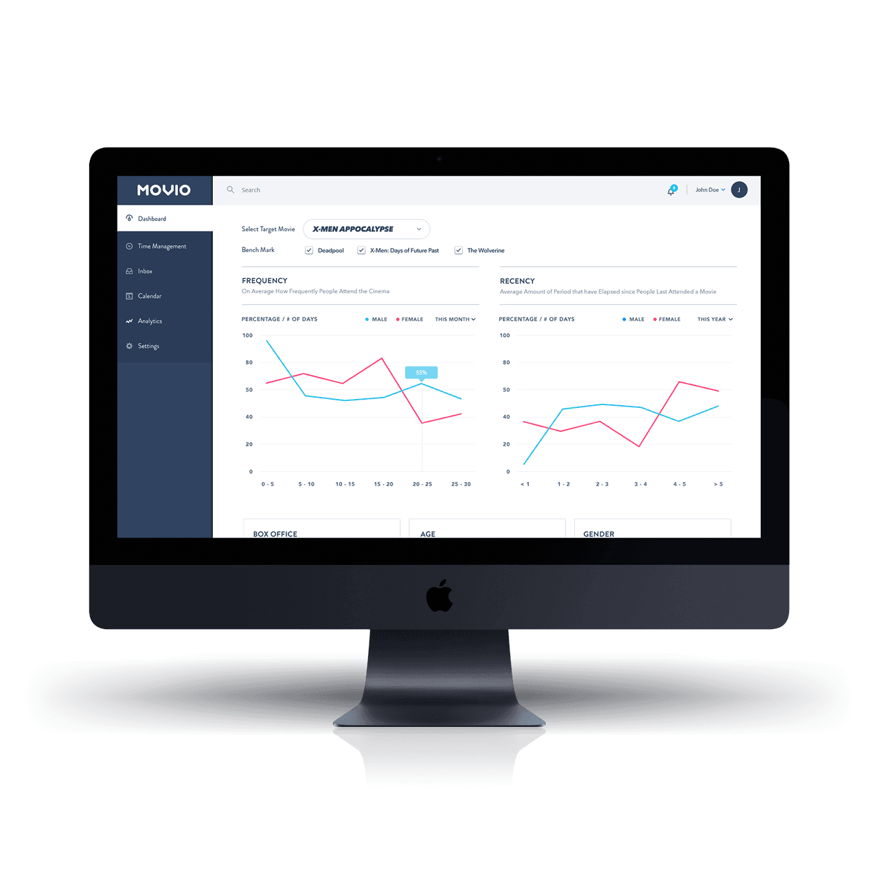
The analyst is interested in five key audience metrics: Frequency (on average how frequently people attend the cinema each month), Recency (the average amount of months that have elapsed since people last attended a movie), Box Office (on average how much people spend on tickets each month), Age (average age of the audience), and Gender (the male/female breakdown of the audience).
The analyst is expecting to be able to view a summary comparing the Target and the Benchmark figures. The analyst is also expecting to see the key metrics broken down and charted in a logical manner, expressing the differences between the Target and Benchmark.
Approach
User persona and product objectives
Geoff is an analyst with a background in mathematics, statistics and economics. He works daily with data, primarily in the form of spreadsheets, but also has experience with more sophisticated business intelligence tools such as SAS, R, or Tableau. Geoff spends a lot of time creating data-driven reports and presentations, so is used to looking at charts and graphs. It is common for Geoff to be working on multiple projects, so Geoff finds it important to quickly identify the relevant pieces of data and determine the best way to present this data to his stakeholders.
Product objectives: Fast, clean and simple. User should not have to do mental arithmetic to understand the differences between the Target and Benchmark. Browser-based product optimised for desktop usage.
Outcome
Dashboard UI for cinema analytics
The dashboard UI design delivered a clean, fast interface for cinema analytics that surfaces key metrics without forcing analysts to perform mental arithmetic. Charts and data visualisations express the differences between Target and Benchmark audiences clearly.
The design prioritised the specific needs of film studio analysts like Geoff: quick identification of relevant data, downloadable data for offline work, and natural language insights where appropriate.